Paddock: Race Day, From the First Click
I rebuilt how Braking Lab looks and feels. Here's what changed, why, and what I left alone on purpose.
Preparing for a race usually feels like homework. You check the schedule, pick a car, study the track and fight with a setup, spread across spreadsheets, Discord threads and a dozen tabs. Then you leave the pits, everything goes quiet, and that’s the part you came for.
Braking Lab is everything before that moment. And for a while it looked like any other tool. Clean, dark, tidy. It could have been for spreadsheets, invoices or servers. Nothing about it said race weekend.
So I rebuilt it: the logo, the website and every screen of the app. The new look is called Paddock. The idea is simple. Opening Braking Lab should feel like walking into your box on a race weekend, not like opening a spreadsheet.
Here’s what changed, why, and what I left alone on purpose.
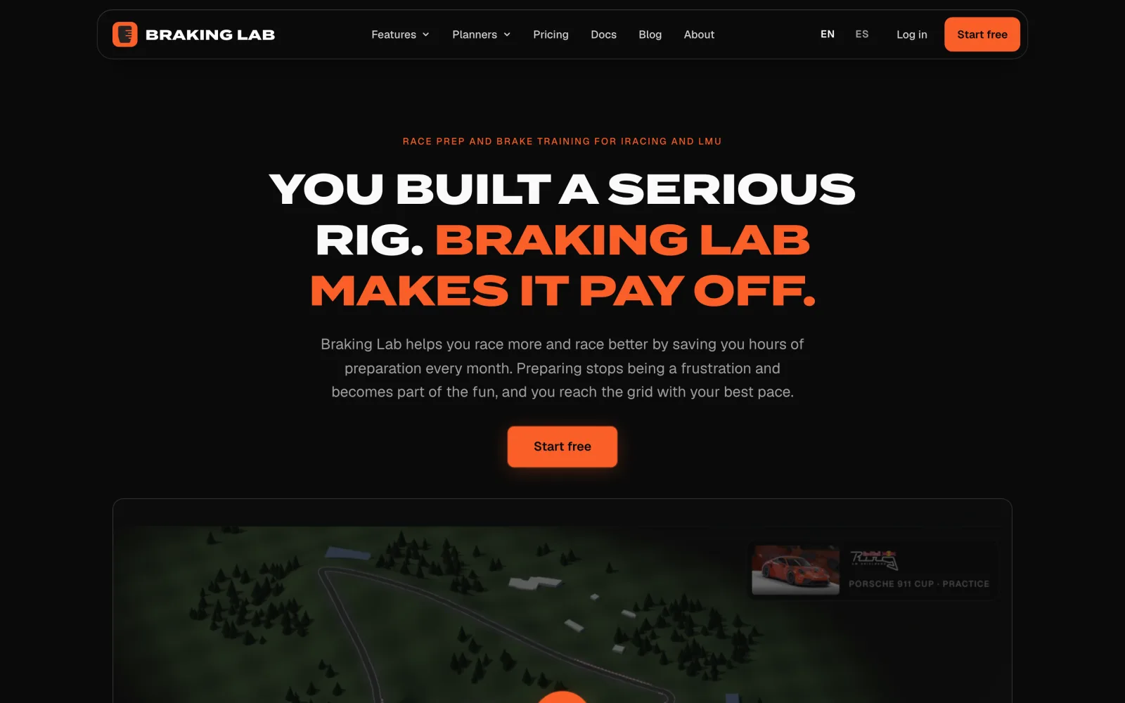
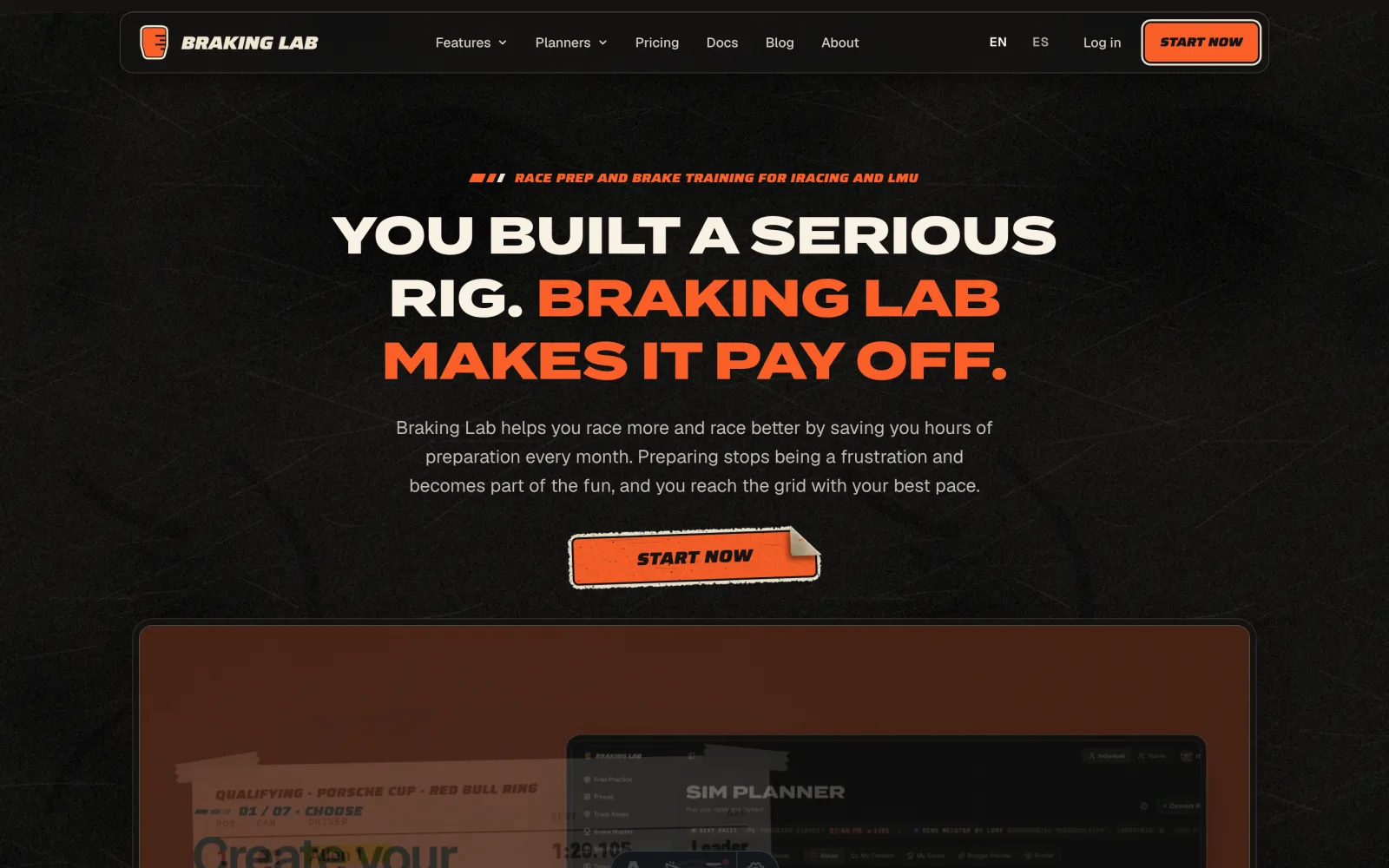 Before After
 Why the paddock
You know the feeling of a race weekend. You’re still walking to the main gate and you can already hear the engines. There’s fuel in the air. The sound gets into your chest and your heart picks up with it. I want the time before you drive to feel like that, not like homework.
Braking Lab is where you prepare. You plan the race, practice for it, and review it afterwards. That’s what a team does in the box. The car is on stands. The run plan is taped to the wall. Everyone’s getting ready for the next session.
That’s the job. So the design should look like the place where that job gets done.
But I didn’t want a costume. A racing theme slapped on top of a product is easy to make and tiring to use. So there’s one rule: the motorsport stays around your data, never on top of it. Your traces, lap times and braking zones stay plain and readable. Everything else can smell a little like the paddock.
The logo
The logo is still a brake pedal. The old one was dark with orange lines, and on a dark background it disappeared. A logo you can’t see isn’t doing its job.
 Before
  After
After The new one is an orange pedal with four ink lines, an ink outline, and a cream die-cut edge around it. That edge is what makes it read as a sticker, and it keeps the mark visible on any background. Next to it is a new wordmark in heavy italic caps, like the lettering on a livery.
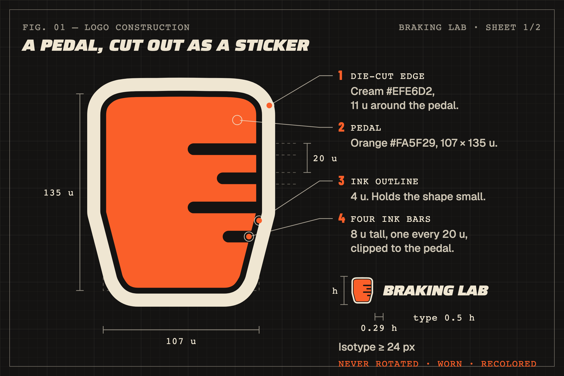
The logo has strict rules. It’s never rotated, never worn, never recolored. It’s a fresh decal, applied straight. The scuffed, tilted stickers belong elsewhere.
Stickers have a job
Race cars have always been covered in decals, and almost none of them are decoration. The number tells you which car it is. The sponsor tells you who pays for it. The scrutineering sticker tells you it passed inspection. Each one says something.
So that’s the rule in Braking Lab too. A sticker shows up when something deserves your attention: a streak you’re keeping, a race you flagged as a priority, the verdict of a coaching report. If there’s a sticker, read it. If there’s nothing to say, there’s no sticker.
The app
Every section now uses the same language, from Pitwall and Free Practice to telemetry, setups, teams and race prep. Things look like the objects they already are at the track:
- Your next race and your race record sit on a pit board.
- Your Brake Master license is a plate with your class on a colored band.
- Races on the calendar are tickets with a torn date stub.
- Your plan is a paddock credential on a lanyard.
- Coaching reports and lap sheets are paper, like a run sheet on a clipboard.
- Help opens as a driver manual.
None of this is clever for the sake of it. A plate holds the key numbers. A ticket tells you where and when you race. A credential tells you what you have access to. You already know how to read these things. That’s the point.
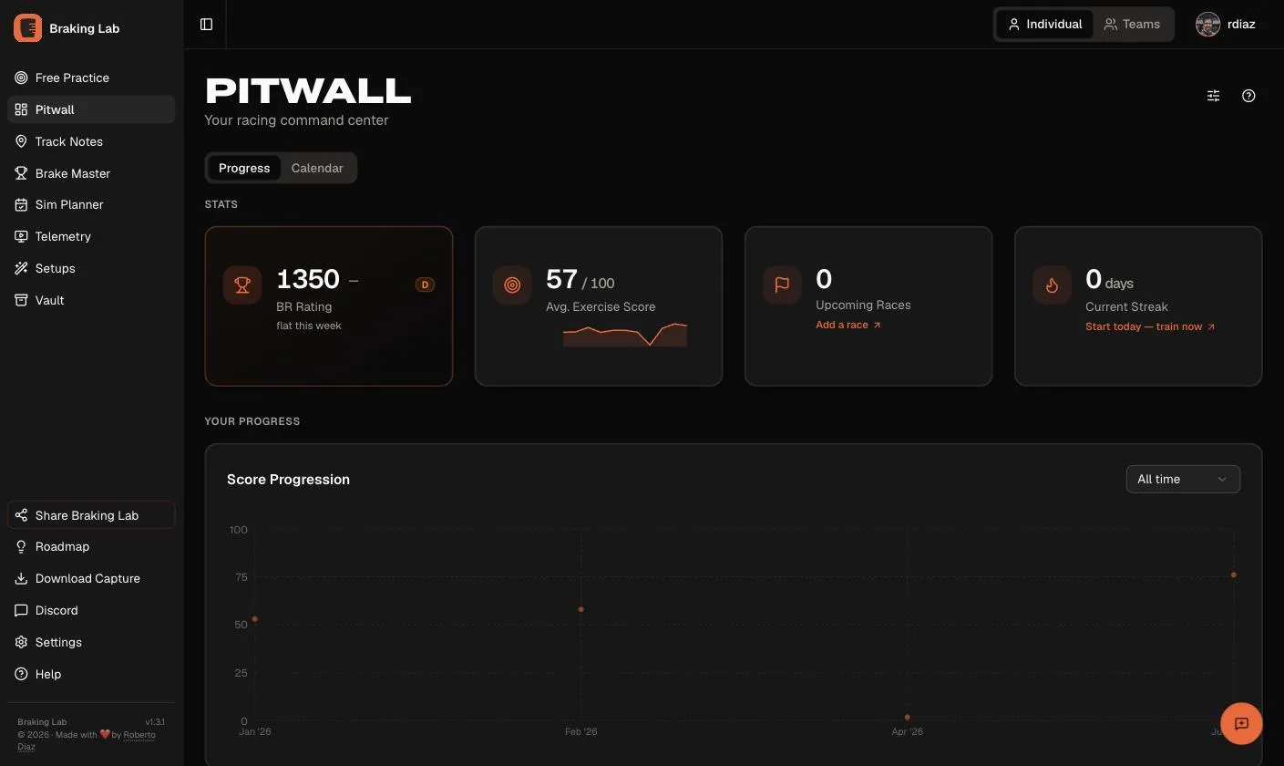
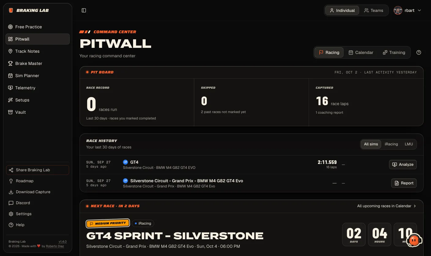 Before After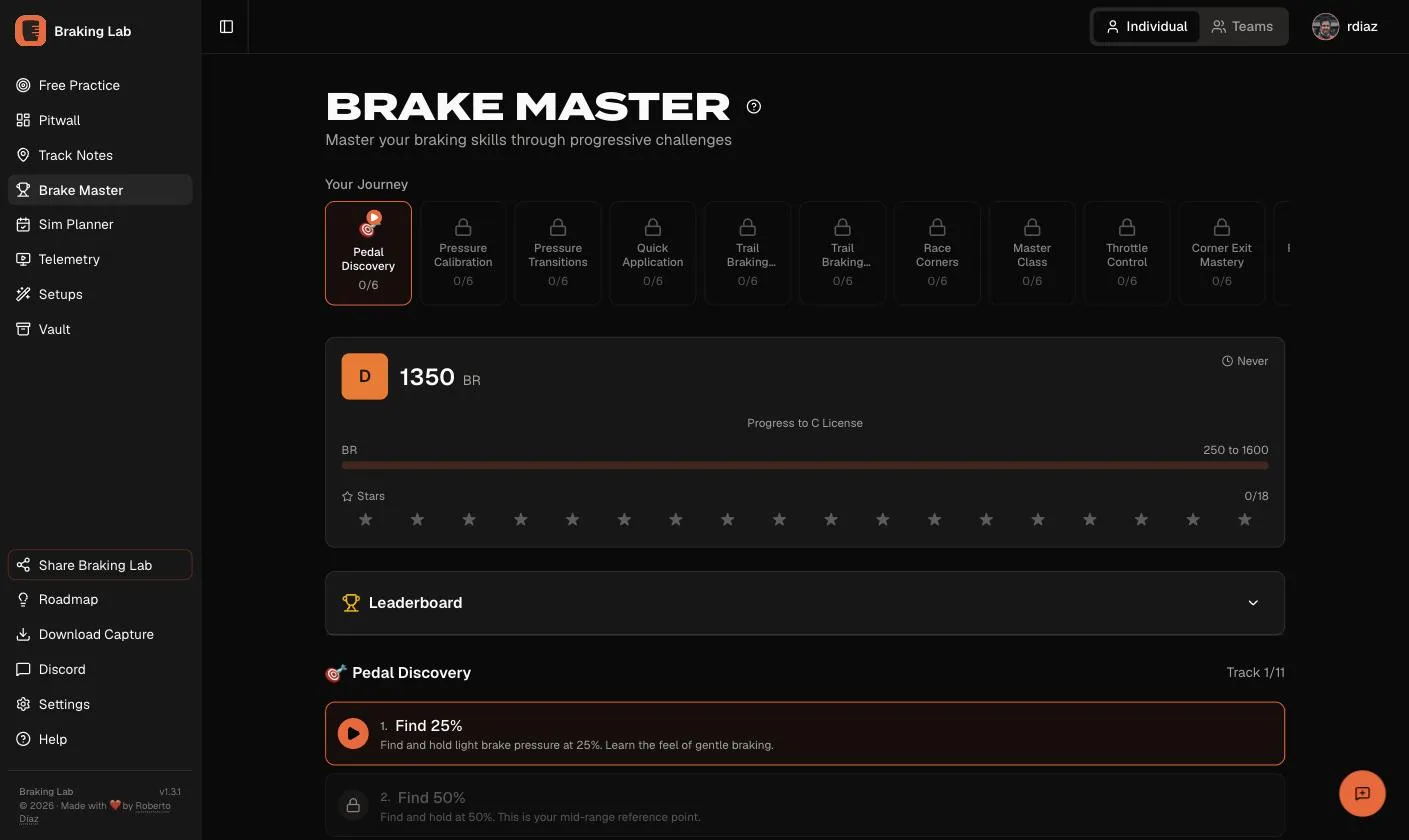
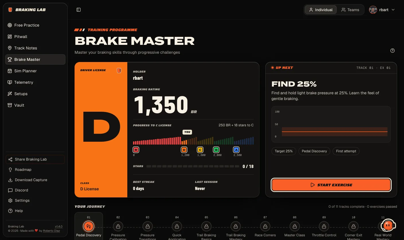 Before After
 Some changes go deeper than the look:
- Race prep is rebuilt. The race detail, the form and the prep assistant are new. Strategy now splits your stints with a fuel reserve and gives each stop its own pit window.
- First laps are guided. Each first-laps board tells you the next step.
- You see your plan before you click. Every feature shows which plan includes it. The sidebar marks what yours doesn’t include yet. No surprises after the click.
- Free Practice is faster. The run starts the moment the 3-2-1 ends, and the brake trace draws in the same frame it’s read.
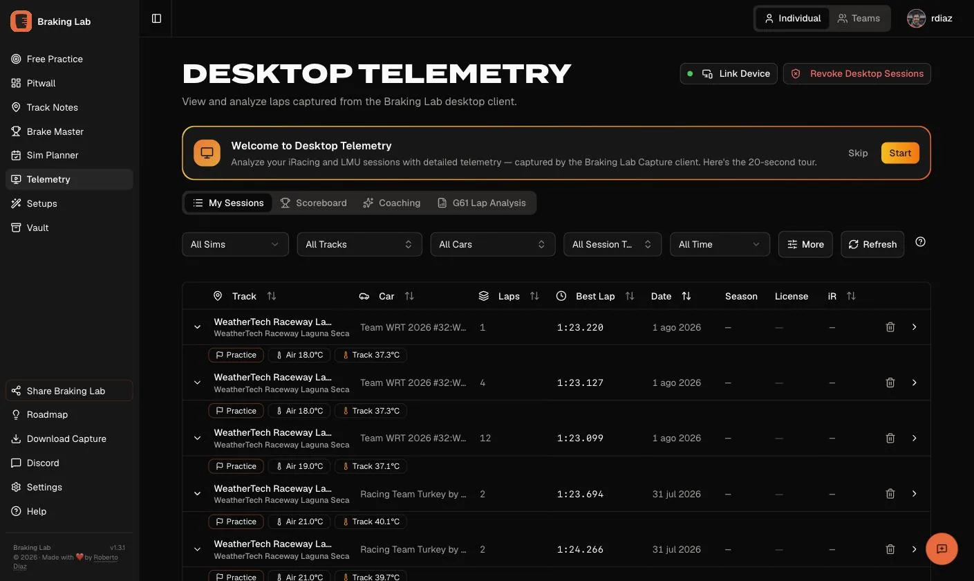
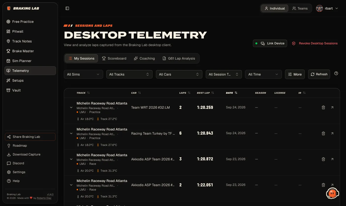 Before After
 What I didn’t change
This part matters as much as the rest.
Telemetry colors stay exactly where they were. Brake is orange, throttle is green, speed is cyan, the reference is red. A trace you saved in July reads the same today. Changing those would have looked fresh for a week and confused you for months.
License colors stay on licenses. R, D, C, B and A only ever mark a license. Never a button.
There’s one orange for actions. If it’s orange and you can click it, it’s the main thing to do on that screen. One per screen.
Every section is where it was, and the data behind every screen didn’t change. And if a design element has no real data behind it, it’s hidden. Not faked.
Warmer, quieter
The old grays were pure, neutral grays. Paddock nudges each one a step toward
ink (#141312) and cream (#EFE6D2). You won’t notice it in a screenshot. You
will after an hour. It feels less like a terminal and more like a workshop.
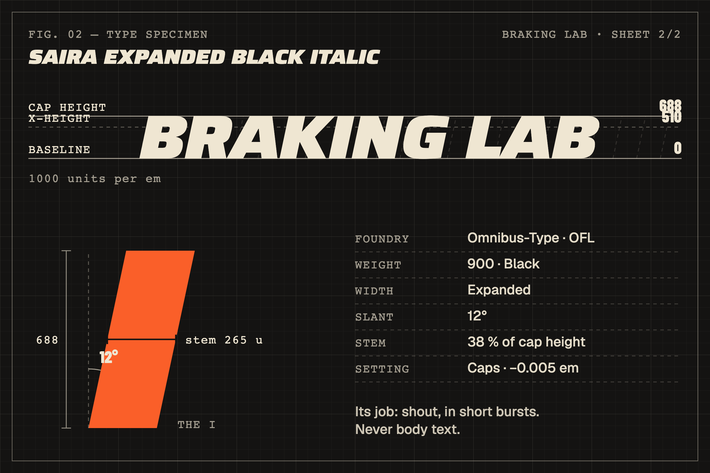
Type got the same treatment. Each font has one job. Termina heads the pages. Geist does the reading: body text, tables, forms. Saira Expanded Black Italic shouts in short bursts: the wordmark, labels, buttons. Barlow Condensed carries the numbers, with tabular figures, so lap times line up in a column.
The loudest of the four is the wordmark face, so here it is up close. It’s heavy (weight 900), wide, and leans 12 degrees forward. A single stem of the I is 38 % as wide as the letter is tall. That’s what makes it read like a number on a door.
The website has an opinion now
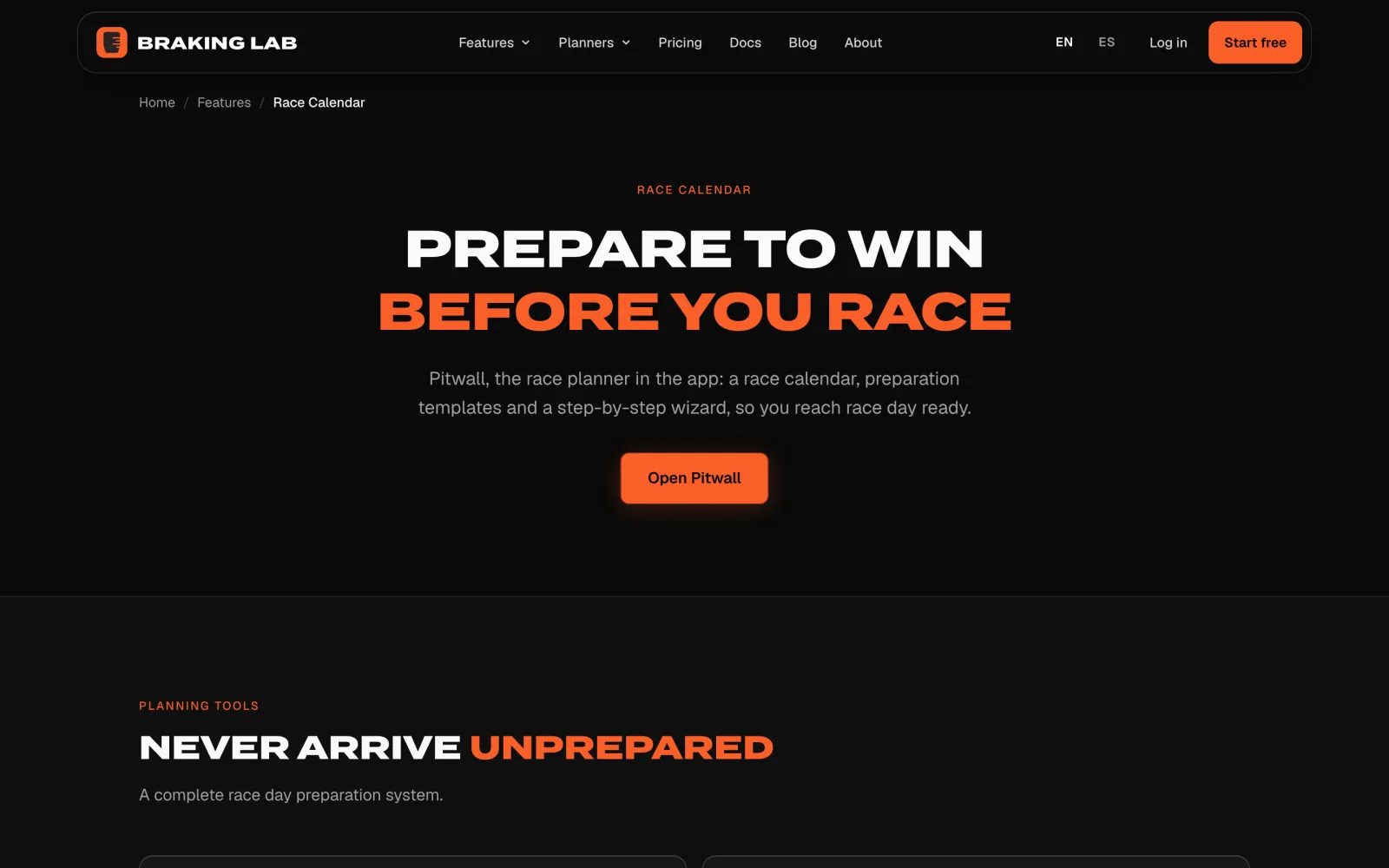
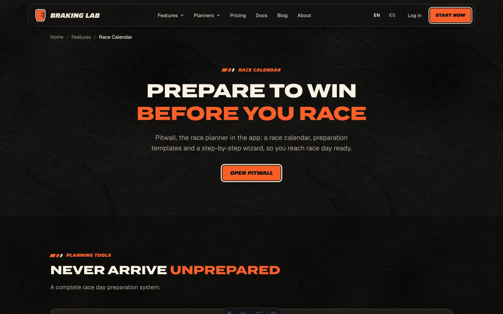
The website got Paddock first. It also got more direct. It doesn’t list features anymore. It walks you through a race week: plan the race, practice for it, review it with Ray.
The home opens with a short film of a race week, with Ray in it. The main button is a paper sticker. Go ahead and try to peel it.
It’s also easier to read. Muted text on cards used to sit around 3.7:1 contrast. It’s now at least 4.5:1. Links in docs and blog posts are underlined, not just a different color.
 Before After
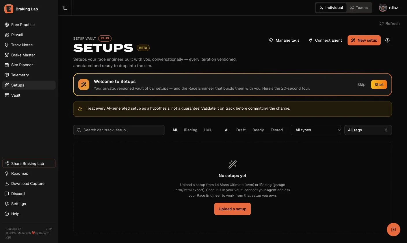
 Setups with Ray (Plus and Ultra, beta)
A setup from a good setup shop is solid work, built by fast, skilled people. But it was built for their driving, not yours. Setups Beta gives you an engineer for the setup you own.
It runs in your AI assistant: Claude, Codex, Cursor or any agent that speaks MCP. ChatGPT works through Developer Mode until its public listing is ready. It goes like this:
- Describe the problem. “Understeer on entry to turn 3.”
- Ray reads your setup and your data. The setup in your library, and the telemetry from runs you’ve confirmed. Then Ray proposes one small change and explains the reasoning.
- Drive it and report back. The next proposal starts from what happened on track.
In LMU you get a new .svm to download. In iRacing you get the garage changes
to make in the sim. Every version stays in your private library, with its notes,
so you always know what you tried and why.
Each proposal is a test, not a promise of lap time. Ray won’t tell you a change will make you faster. Small changes, checked on track, are how setup work actually goes. Keep what works for you.
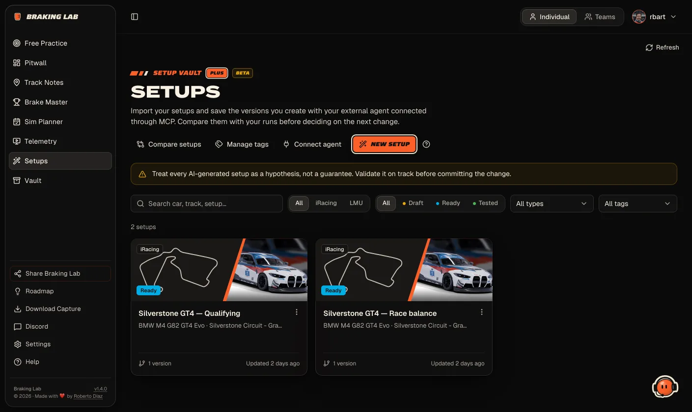 Before After
 Read how Setups works to get started.
Ray, your Race Engineer
If you’ve connected Braking Lab to your assistant, you’ve already worked with Ray. Ray is the Race Engineer behind it. Ray reviews your laps corner by corner, helps you prepare your race week, and works on your setups.
Ray didn’t have a name before. Now Ray does, and Ray lives in the app too.
Ray greets you on your first-laps boards and tells you the next step. When the app updates, Ray tells you what’s new. And Ray is where you go for help and for feedback. Tell Ray what works and what doesn’t. It comes straight to me, and I read all of it.
There are also nine optional Race Engineer skills you can add to Claude, Codex, Cursor and other agents, for jobs like race prep, lap comparison and setup work.
Accessibility isn’t a separate project
It’s part of the style, not a pass at the end. Text contrast is at least 4.5:1 everywhere. Tabs work with the arrow keys, Home and End. If you turn on reduced motion in your system, the credential doesn’t swing and the bars don’t animate.
One more thing
Ray has been busy. Not with your setups this time. With Capture, the desktop client.
Ray is working hard on making Capture… different.
Until now, Braking Lab has been everything before you leave the pits. Next, it will be there while you drive, too, and Ray will be at the center of it. Soon I’ll be able to show you how that changes your time on track. Stay tuned.
Until then, open the app and look around. Then tell Ray what you think, or tell me on Discord. The good and the bad. The bad helps more.